It’s hard to believe that this time last year, our house was torn down to the studs, and we were camped out in the spare bedrooms at my mom’s house. In between driving back and forth to school and work, I was spending every free minute researching appliances, studying kitchen pictures on Pinterest, and meeting with my contractor and designer. With Thanksgiving coming up, I’m especially grateful that our renovation is done and that our home is now a slightly larger and much more functional version of itself that still its history — and ours.
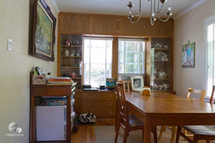
While kitchens are often the stars of today’s homes, for big holiday meals, the dining room is still an important gathering place. Before our remodel, our dining room also doubled as a home office, homework space and craft center (I know, that was more than doubling).
To make it all fit, we put plastic storage units inside an antique sideboard and there was constantly clutter and paperwork everywhere. Wood built-ins surrounded the windows on one end of the room. They provided a lot of storage and display, but the drawers were really rickety, and we weren’t sure whether they were original to the 1930s architecture.
We knew we wanted to open up the wall to the left in the picture, above, which would create a larger entryway to the kitchen and a peninsula counter, with cookbook storage underneath. As we headed into the demo, we realized that there had been quite a bit of work done there before. That wall had previously had two doors, probably in-and-out style openings into the kitchen. When the old cabinets were ripped out, the paint and drywall (most of the house had lathe and plaster walls) revealed that someone had remodeled it in the 1950s or 60s. Our old kitchen cabinets were basically the exact same ones that Betty Draper had in season one of Mad Men, and I think the dining room cabinetry was built in the same era.
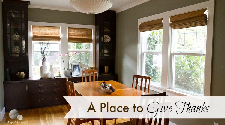
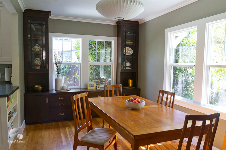
It’s hard to believe that this new dining room is the same place one year later…
I worked with interior designer Sarah Gaffney, who brought years of experience with the Sunset magazine idea houses, to remake this room in a more of a Craftsman bungalow style that would be reminiscent of it’s original era. Even with the java stained oak cabinets and more saturated paint (Benjamin Moore Sandy Hook Gray), the overall effect feels brighter and more open.
One aspect of the Arts and Crafts movement that I find interesting is how many of the designers and architects were influenced by the simple lines of Japanese design and how that clean look was symbolic of a simpler and more meaningful lifestyle, with less consumption of mass produced goods that was beginning to be made possible by the Industrial Revolution. So basically the Konmari of the turn of the century.
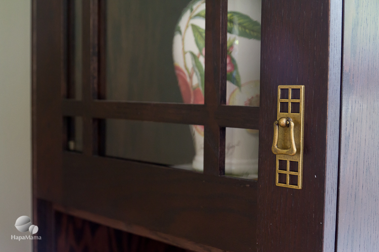
These elements are clear in some of the cabinetry and hardware styles. The panes on these cabinets reminds me of doors found in Japanese-era buildings in Taiwan. I thought these brass cabinet and drawer pulls reflected that sensibility, too.
Since these photos of my dining room were taken, we’ve finally added some window coverings. They are natural fiber waterfall shades from The Shade Store. Here’s another photo of it taken more recently:
The room doesn’t get as much sunlight now that it’s fall. As you can see, I gravitate towards a sort of organic style with natural fibers, wood grain, hammered brass and pottery (I should show you closeups of the crackled pot with the orchid… it’s very similar to the tile in my kitchen).
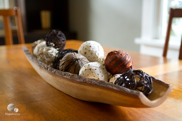
I like to build upon that as far as Thanksgiving decor. Maybe I’ll replace these natural-ish looking balls with apples, seasonal gourds, or branches, any of which can be very natural, yet elegant ways to add a festive touch to the table. I’ll try to update this with more pictures as it gets closer to the holidays…
Our October blog carnival is about how we give thanks. Check out what cool things my fellow AsianMomBloggers and their family do during this season of thanks.
- Maria at Bicultural Mama: Crunchy Ramen Asian Salad Recipe
- Thien-Kim at I’m Not the Nanny: Slowing Down to Give Thanks
- Phyllis of Napkin Hoarder: Three Ways to a Grateful Heart
- Stephanie from Frankly, My Dear: An Attitude of Gratitude




I love this. My husband and I need some interior design help.
Gorgeous!
What a beautiful dining room! I love the new light fixture, wall colors, and brass handles. It’s very welcoming and warm. You did a great job!
It looks wonderful! I love that paint color with the darker wood. I was going to ask you what color that is so thank you for putting that in there. After 10 years of living in our house, we are finally painting…better late than never!
You’re welcome, Angela. Also paints can look really different in each house — or even room. Hope it works out for you!